Hap
THE ♲ SYMBOL
Thinking outside the box
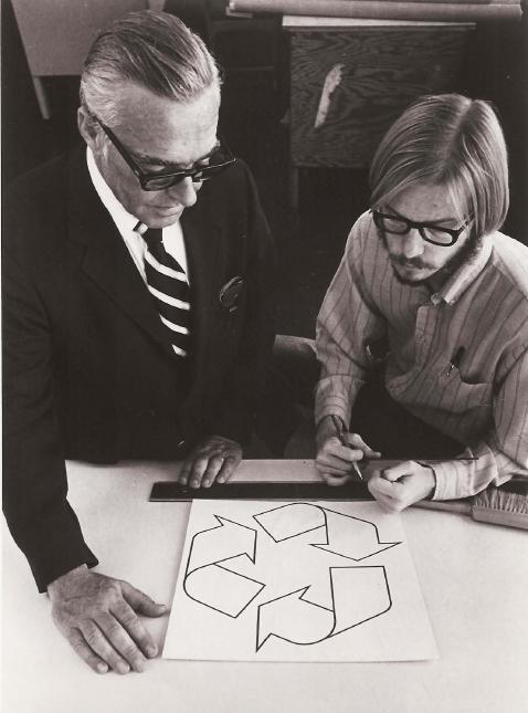
The first Earth Day, celebrated by 20 million people in April 1970, not only led to the formation of the EPA, it also launched an unusual contest. A Chicago-based cardboard-box company called Container Corporation of America (CCA), a pioneer in manufacturing recycled products, was looking for a simple design to print on all of their recycled boxes. Inspired by the success of Earth Day, Bill Lloyd, the graphic designer at CCA, decided to advertise the contest nationally at America’s high schools and colleges. “As inheritors of the Earth, they should have their say,” he said.In Lloyd’s grand vision, the winning design would be more than a symbol printed on CCA’s boxes; it would serve as a symbol to promote the nationwide recycling movement. First prize: a $2,500 scholarship to the winner’s choice of colleges. More than 500 entries came in from students all over the nation.
Twisted
The winner: Gary Anderson, a 23-year-old graduate student at USC. He drew his inspiration from 19th-century mathematician August Ferdinand Möbius, who noted that a strip of paper twisted once and joined at the tips formed a continuous one-sided surface. Commonly referred to as a “Möbius strip,” the geometric shape has since shown up in engineering (conveyor belts that last twice as long) and in popular art, such as M. C. Escher’s fantasy-based woodcuts “Möbius Strip I” and “Möbius Strip II (Red Ants).”It was that combination of practicality and art—along with the recycling-friendly notion that everything eventually returns to itself—that put Anderson’s design at the top of the contest finalists. “I wanted to suggest both the dynamic—things are changing—and the static equilibrium, a permanent kind of thing,” he later recalled. (After the design was chosen as the winner, Bill Lloyd altered it slightly; he darkened the edges and rotated the arrows 60 degrees so the interior of the symbol resembled a pine tree. In Anderson’s version, one of the pointy ends faced down.)
CCA attempted to trademark the recycling symbol, but after they allowed other manufacturers to use it for a small fee, the trademark application was held for further review. Rather than press the matter, Lloyd and the CCA decided that a petty legal battle over such a positive message was a bad idea. So they dropped the case and allowed Anderson’s creation to fall into the public domain. The three arrows have since come to represent the three components of conservation: Reuse, Reduce, Recycle.
Symbology
Although anyone is free to use the recycling symbol as part of an advertising campaign (or as a graphic on a page…like in a Bathroom Reader), its use to advertise a commercial product’s recycling properties is strictly regulated by the Federal Trade Commission’s “Guides for the Use of Environmental Marketing Claims.” There are several variations, but here are the symbol’s two main classifications:
• Recycled: If the arrows are surrounded by a solid black circle, then the product is made from previously recycled material. A percentage displayed in the center of the symbol denotes how much of the product was made from recycled material. (If no percentage is denoted, it is 100% recycled.)
• Recyclable: If the arrows are not surrounded by a circle, then the product is recyclable, but only if the “regulations and/or ordinances of your local community provide for its collection.”Still at It
Nearly four decades later, Gary Anderson remains active in the green movement. After earning his Ph.D. in geography and environmental engineering from Johns Hopkins University in 1985, the architect-by-trade has spent the bulk of his career as an urban planner with a focus on controlled growth. When asked how it feels to have created one of the most popular symbols in the world, Anderson tries to downplay his accomplishment, but admits that it’s “pretty neat.”
Mostly Related Extras
• An article on the symbol from Frieze Magazine
• How green are cane toad golf gloves?


