
Interview with letterer John Roshell
.
How were you involved with the Show Me History books? And what was your favorite part of this project?

I designed the fonts and established the look of the lettering, then supervised my crack team of Comicrafts people in lettering the stories. We also designed the front and back covers and the introduction and ending pages.
My favorite part of this project was seeing the lettering and final artwork come together. Especially on stories of this length, there were a lot of things in various stages of completion, so when each story was finally assembled and we could read it start to finish, the whole suddenly became much more than the sum of the parts.
I also really liked seeing all the clever and funny ways Kelly Tindall used Sam and Libby in the Earhart and Hamilton. I could tell he was having a lot of fun with that, which inspired me to use all the lettering tricks I could think of to take those ideas even further.
Were you always interested in comic books and graphic novels? Or is this a love you discovered as an adult?
I was hardcore into Spider-Man comics from age 8 til about 12 or 13. Then I lost interest, and rediscovered them at 18 or 19 when Todd McFarlane and Erik Larsen were drawing Spidey with the crazy “spaghetti” webbing and the fun exaggerated, acrobatic poses. I really related to Peter Parker as a nerd in his regular life, who becomes confident and sarcastic when he uses his super powers. Though I’m still waiting for my super powers…
How did you first enter the industry?
A few months after graduating college, I got a call from a friend of a friend of a friend who was a comic letterer looking for someone to enter scripts into his new computer system. That was Richard Starkings, who I still work with 25 years later at Comicraft.
Where do you find inspiration for your typeface designs?
Old comic books are a big source, but everywhere I go, I take pictures of signs and manhole covers and graffiti art, and anything with cool letter shapes that hopefully haven’t been turned into a font already by someone else. It drives my family crazy – “where’s Dad??” “Taking pictures. He’ll catch up…”
We know that you are a pioneer of computer techniques that are used to letter a lot of comic books. Can you give us an example of such techniques? How much of the work is done by computers and how much is done by hand?
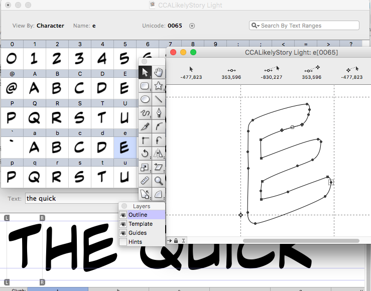
I’ve never met anyone that letters with their actual hand… there are a few people that still regularly use a tool called a pen, usually at the request of a writer or artist who really want that look. But ink is messy and there’s no undo command. The vast majority of comics published in the U.S. are lettered with Adobe Illustrator, using fonts we, or others ,or the letterer themselves, created specifically for lettering comics.
If you want to learn how to do it, we created a book Comic Book Lettering the Comicraft Way, an online class on LinkedIn Learning (formerly Lynda.com) and a website www.balloontales.com that will show you how!
They call you “Mr. Fontastic,” so we have to ask…what is your favorite font?
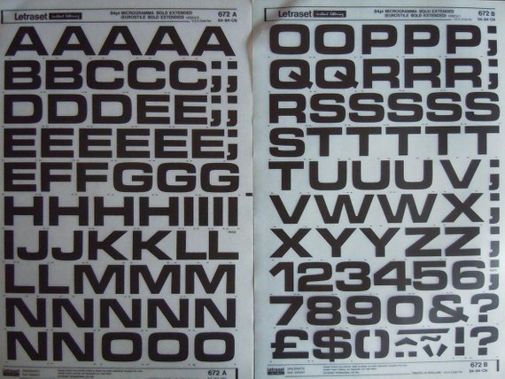
When I was a kid, the first letter shapes I recognized as being part of a typeface – and not just words that said things – were Eurostile Bold Extended (a.k.a. Microgramma), and Gill Sans. They are still two of my favorites. In high school, I bought sheets of Letraset rub-on letters for Microgramma and used them everywhere I could – cassette covers for my band, flyers for school events, class projects. I was thrilled to have use of those letters myself. And then when I started working for Richard, discovering that I could create my own fonts was mind-blowing!
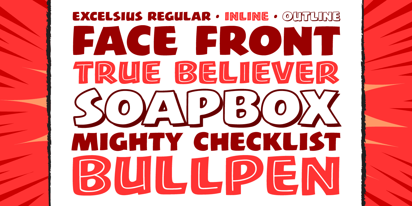
My favorite of my own fonts is usually whichever I created most recently. Excelsius is a big, bold, lively font I made late last year shortly after Stan Lee passed, inspired by the comics I grew up reading, and as a tribute to the joy he brought my 8 year-old self.
Where to find John Roshell:
Twitter | Instagram | Website
Want to learn more about the contributors of Show Me History? Click here to read more.
